THE BEAUTY OF MOVIE POSTERS
When I was in primary school, I would always look outside my school bus through the window to look up at the billboards that had movie posters. And I was so captivated by it that I started to read and study different kinds of posters.
Movie posters are something that most of us don’t pay much attention to, but it is far more important than just a piece of design or art. Movie posters fall somewhere between the realm of design and art. To make the poster feel cinematic, it requires a certain kind of aesthetic, sensibility and should also share a glimpse of the story. A movie poster can work wonders for the film, it can make it or break it. That’s why there are multiple poster designing agencies that only work in making the poster for the film.
In Hollywood, there are awards for remarkable poster art. The bar for posters is much lower in our country (mainly Bollywood). Before the trailer or the teaser of the film, the first thing that the audience sees is the poster. Without a poster, we are solely relying on words that can get dull very quickly.
As people who are not into filmmaking, we do not break down these posters and find the true meaning, so I will be breaking down 3 movie posters and show how I analyse a poster and discover the beauty that it holds.
Poster #1: PSYCHO (1960) by Alfred Hitchcock.
Psycho is a 1960 psychological thriller-horror movie directed by Alfred Hitchcock. The poster was designed by legendary graphic designer, & academy award-winning filmmaker Saul bass. The poster contains 3 major things- the lead character of the movie, the title and the names of the cast, director, producer etc. the colours that are mainly used here are yellow, blue, red, white and black.
In the poster, the girl is looking away from the man in the back on the left side of the poster. She is also in her undergarments which indicates that she’s either a mode or she is a victim of an assault. The picture of this character and the title are both in yellow, which indicates that there might be a connection between the two. The two men in red are smaller compared to the women in yellow, which indicates that their role is smaller compared to that of the woman’s. The fact that they are in red might symbolise that one could either be the love interest or a murderer. It also highlights the genre of the movie- which is thriller- horror. The colour black in the background sets the mysterious tone of the film.
So, what message does this poster send? The artist is trying to send the genre across to the viewers as the message. The genre is psychological thriller horror. (Although it would have seen easier had there been a weapon to give more clarity to the viewers)
Jaws is a 1975 horror-adventure film whose poster was designed by Roger Kastel. This is a well know and iconic film. It is still well knowing throughout the different age generations.
When we first look at the poster two things capture our attention. The first thing is the title “jaws” which is written in red bold letters. The red colour could be seen as representing blood and violence which is a hint to the content of the film. This allows the audience to know what they are getting into and what they can expect out of this film. The second thing that captures our attention is the shark attack and the victim who is unaware of her fate. The teeth of the shark are also visible which suggests that what was about to happen to the woman. The colour of the shark and the colour of the water are pretty similar, which tells us that the shark is camouflaged in water and also gives the element of surprise which makes it eviller. All these elements make the audience want to buy a ticket to the film and find out what happens next.
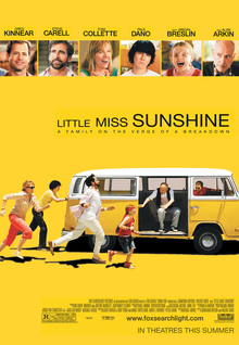
Poster #3: LITTLE MISS SUNSHINE (2006) by Valerie Faris & Jonathan Dayton.
Little miss sunshine is a comedy-drama film and its poster was designed by BLT Communications.
The first things we notice about this poster are the bright yellow , the Volkswagen van, and the people running towards it. The picture on the poster comes from the movie. The yellow van is a symbol of freedom, and the word "Volkswagen" in German means "people's car." These vans are known for breaking down often, and the movie posters make fun of this by showing a family running after a vehicle that keeps breaking down. The image of the car brings to mind travel, as well as adventure and freedom, which are all important themes in the movie. The image gives a clear picture of what happens in the movie and shows how funny it is. The name of the movie has something to do with the colour yellow. This poster shows the story, cast, crew, and type of movie in a clear way. Together, the picture, colours, and taglines show what kind of movie it is. From the poster, it's clear that the movie will be both funny and exciting.
Hence, posters are more important than you think. the saying “a picture is worth 1000 words” is true. One picture can tell a story in more detail than 1000 words ever could.


Comments
Post a Comment